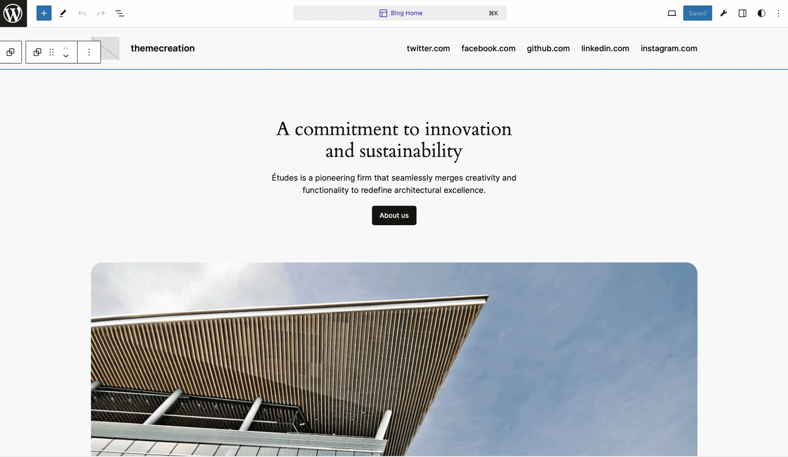
You can quickly check your design on three device sizes in the site editor using the ‘View‘ tool.
This allows you to check:
- Desktop
- Tablet
- Mobile

You can quickly check your design on three device sizes in the site editor using the ‘View‘ tool.
This allows you to check:

Looking for a tip? Use the archive or search.
Editor tips is a little project that shares tips regularly for the editor to follow along on ‘X’ also.
©2024 crafted on WordPress, made by logicalbinary.